10 Design Tips from the League of Legends VFX Style Guide
Aug 29, 2022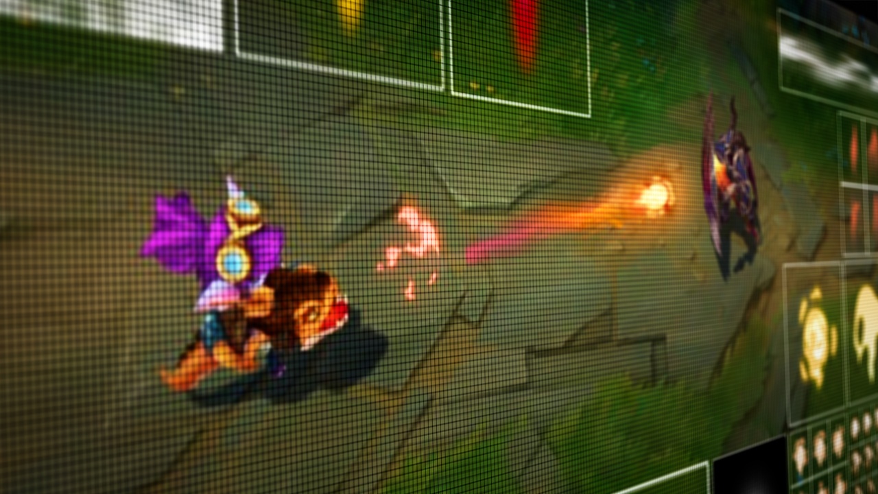
10 helpful tips straight from the League of Legends VFX Style Guide on all things related to design and motion.
When Jason Keyser worked at Riot Games, one of the most valuable pieces of educational content FX artists had access to was the League of Legends VFX Style guide. The guide was written and designed by Riot Games Art Director Jin Ho Yang, aka "Riot Jino." It's an all-encompassing look at what 2D FX designers and animators should consider when thinking about creating FX for League of Legends.
While League of Legends is obviously the focus of the guide, the information within is incredibly valuable to VFX artists of all kinds. Whether you need to establish your own style, build a greater understanding of the craft, or dive into the principles of animation, all FX artists should reference this guide to not only better understand FX, but how it relates to gameplay and players themselves.
So, that being said, go download a copy of the League of Legends VFX Style Guide and let's take a look at ten of our favorite takeaways.
1. Emphasize Areas of Focus
Great visual effects are compelling and easily readable within gameplay. FX should clearly define areas of focus with primary and secondary elements. The focal point of an effect should ensure players have a clear sense of an effect's purpose.
The primary shape you create should never confuse a player or force them to take time to figure out what the “idea” behind an effect is. Secondary elements should use color values and saturation to enhance primary elements.
It's all about immediate clarity with minimal visual noise. Even though something might look visually inventive, if it's distracting, then the effect isn’t doing its job.
2. Scale of Importance is Crucial
A visual effect should accurately represent the level of importance of an attack or spell. If a character’s weakest attack is visually the same scale and size as their ultimate attack, not only is it visually confusing, players will also lose their sense of delight and awe.
There is nothing satisfying about building up to a final blow to only see an effect that is no larger or more exciting than any other hit up to that point. FX need to accurately represent what's happening with the characters and the actions being performed by the players.
3. Understand Value Range
Value range is a measurement of the lightness and darkness of a color. Closer to 0% represents black, higher to 100% represents white. Now you want to avoid using the extremes of 0 or 100 and lean towards using more of the mid-range to define your palette. Using a larger value range will also help draw more focus to an effect.
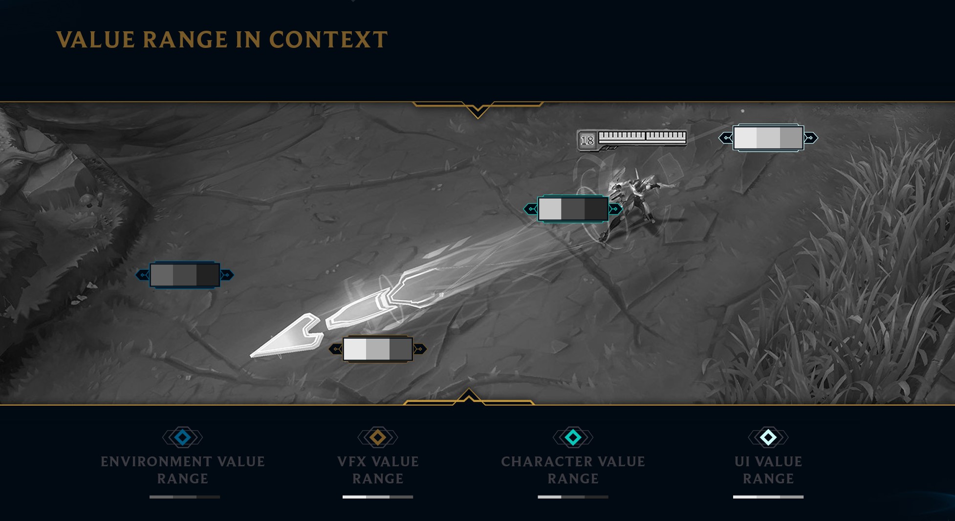
To get a better grasp of value, check out this tutorial from our 5 Must-Know Artistic Principles of Video Game Visual FX series.
4. Use Illumination to Enhance Effects
Here’s a short and sweet tip, use illumination to enhance the contrast or visual clarity of an effect. By pushing the effects value range by adding a glow, you can drastically enhance a magical FX expression.
This simple technique can improve the overall sense of magic to the effect and make it stand out to the player's eye. Illumination adds a greater sense of life to an effect. This will also help with conveying the information about an effect, like its power, direction, and duration. It's important to keep in mind the overall contrast of your effects and how it's either improving or distracting from the action and story happening.
5. Higher Color Saturation Draws More Focus
Just like with values of the brightness, there are values to the amount of saturation you choose to use for certain spells and effects you create. Just like before, you’ll want to steer clear from using 100% or 0% saturation so that you avoid blending into the environment or the UI.
6. Balance Complementary Colors
Think of using colors like you would choosing the value. A healthy amount of contrast will do wonders with giving your effect life and distinguishing itself in a non-distracting way. When you use two complimentary colors, one color must act as the secondary color. A healthy level of contrast only works if there is a dominant color in the effect. Do you best to avoid colors that compete and create noise, desaturating and balancing colors can do wonders in creating a richness to the effect.
In terms of choosing the actual colors, there are general rules for what spells and effects require. For instance, healing spells and effects will always be on the greener side, frost and coldness will always be more blue, and gunpowder will always have an orange-red tint.
7. Hand-drawn Shapes and Textures Are Essential
One of the staple rules we follow as 2D FX animators is to create effects that end up reducing visual noise. The last thing we want is for all of the different elements of the game to be jumbled into one visually incoherent mess that confuses the players.
Choosing shapes is no exception to this rule as there are certain do’s and don'ts that are important to know. First, always hand draw and paint your shapes. The textures that you draw need to be a mixture of soft and hard shapes. When combined with the hand painted textures, you get an organic looking effect that lacks noisy superfluous detail.
Remember, it's all about communication and the shapes you make need to immediately inform the player what is happening. So that means don't layer too many shapes on top of each other and don't use contradictory shapes that look muddled in the gameplay.
8. Add Movement to Your Shapes
Once you have painted a shape, it needs to move in a believable way. Adding blur as it moves through space will give the illusion that a shape is in fact moving. This not only helps communicate the direction of the effect, but also the importance of and the power of the effect. Blurred movement gives a certain sense of time and place as to how long the effect will be moving and where the effect will end up. Motion blue always looks more natural to the human eye than you might realize.
9. Timing is Key
Timing can make or break an effect. As Jason says in the video below,
"Lead the brain with anticipation and then overload the brain in that moment that it's been waiting for, and then you want to give the brain time to process what just happened."
Visual FX artists need a fundamental knowledge of how things move. Look around in the world and take the time to appreciate the visual language of the environments and objects surrounding you. This will allow you to trust your gut when determining if the timing of an effect feels real or if it's taking too long.
10. If Your FX Feel Long, They're Waaaaay Too Long
This tip is pretty simple, but sometimes hard to follow. You don’t want an effect to stay on screen for too long. FX aren’t supposed to be telling the story; they’re supposed to assist storytelling and enhance it along the way.
First, you don’t want an effect lingering on screen in the middle of a battle and jumbling the visuals for the player. Second, the length of the effect informs the player the significance of the effect used. Plus you also want to make room for more effects and not block them if additional spells are being cast in the same area.
BONUS: League of Legends FX Breakdowns.
In his time as a Senior FX Artist at Riot Games, VFX Apprentice founder Jason Keyser worked on League of Legends. In this series of tutorials, you can get an inside look at how he created the real-time FX for some of the game's most popular characters.
Images via Riot Games / League of Legends
Want to learn how to create FX like these?
Start Your VFX Apprenticeship
Begin your journey towards mastering FX for games and animation. Join VFX-A All Access and discover cutting-edge 2D, 3D, and real-time FX training.

