How Style Guides Help Define The Look Of Your Game and FX
Jul 12, 2023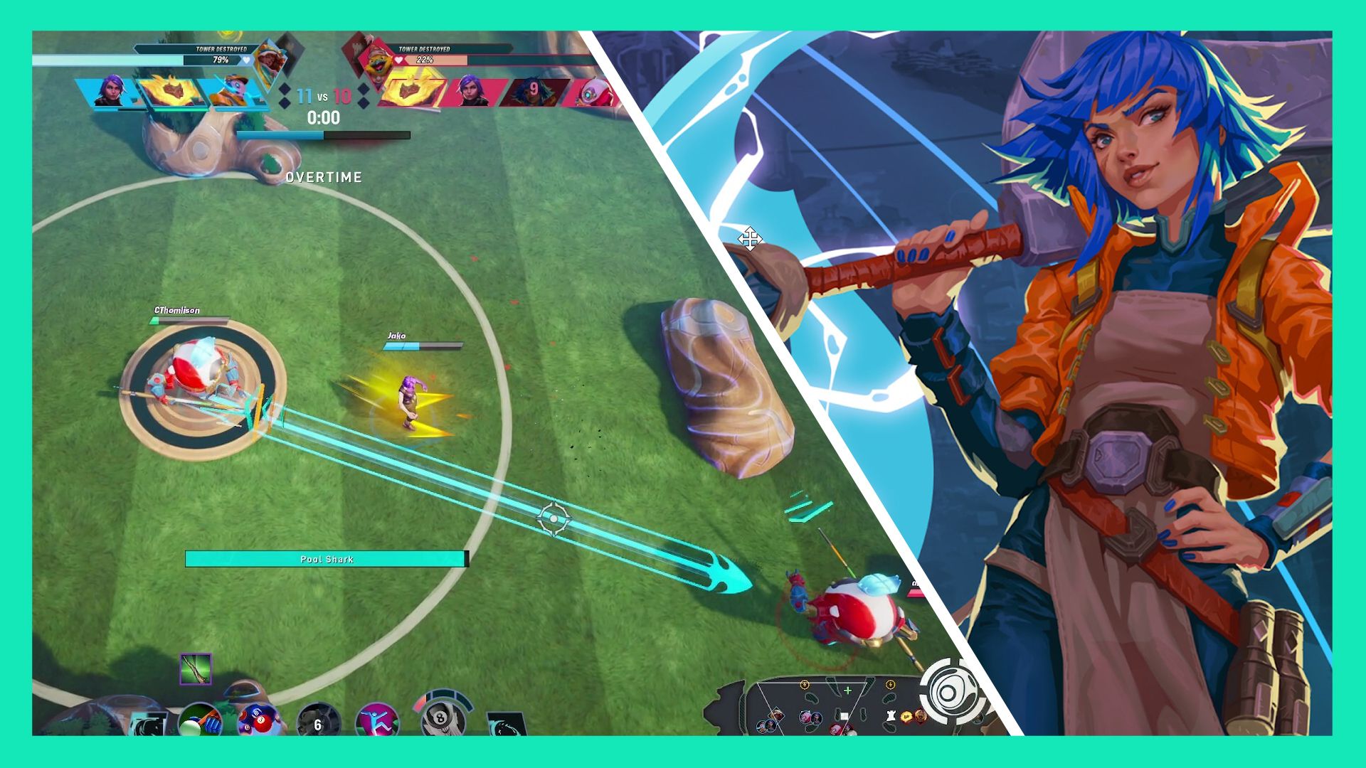
Hot off their Sparkball early access event, Worldspark Studios VFX Director David Hall shares insights to his work, and how he built the VFX Style Guide for the game.
Sparkball is an upcoming 4v4 "Mobrawler" that recently launched in early access mode. The game challenges teams to "balance ballin' and brawlin'" to score goals. Think League of Legends meets Rocket League, or perhaps "Rocket League of Legends."
The free-to-play game is still in development, but players recently had a chance to test their skills during an early access event. That's when we had the chance to catch up with the VFX Director David Hall about his work on Sparkball.

David has history with VFX Apprentice's Jason Keyser, as the two crossed paths working at Riot Games on titles like League of Legends. (PS you can read our writeup on 10 Design Tips from the League of Legends Style Guide here.)
As a friend of VFX Apprentice, we invited David to share some lessons learned from the making of Sparkball.
David, take it away.
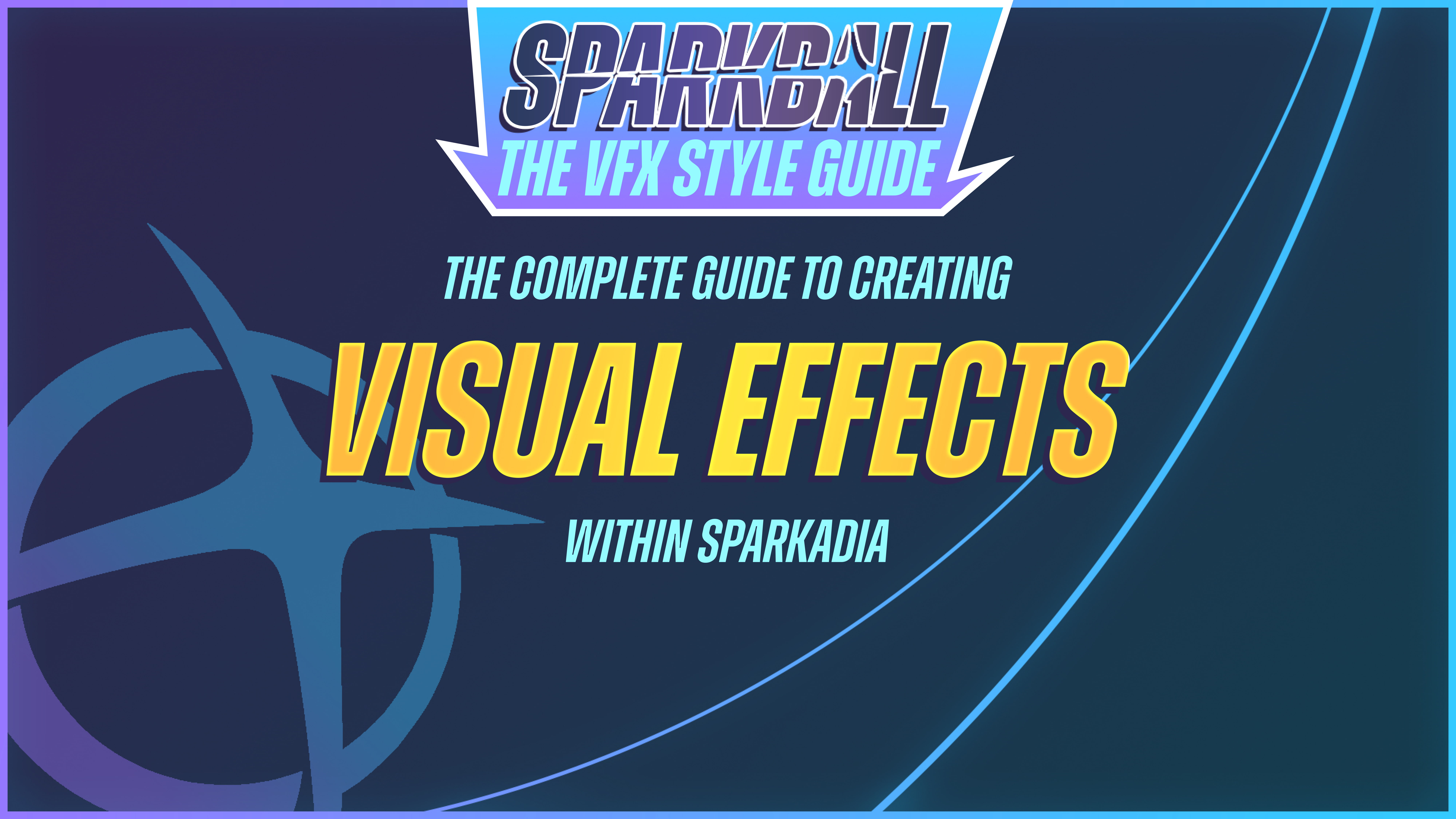
Hello there! My name is David Hall, but folks just call me Hallzy. I’m the VFX Director at Sparkadia, and I recently got the opportunity to put together a VFX Style Guide for our new game, Sparkball!
I’d like to share some thoughts and insights into my process and how we landed on the style we did.
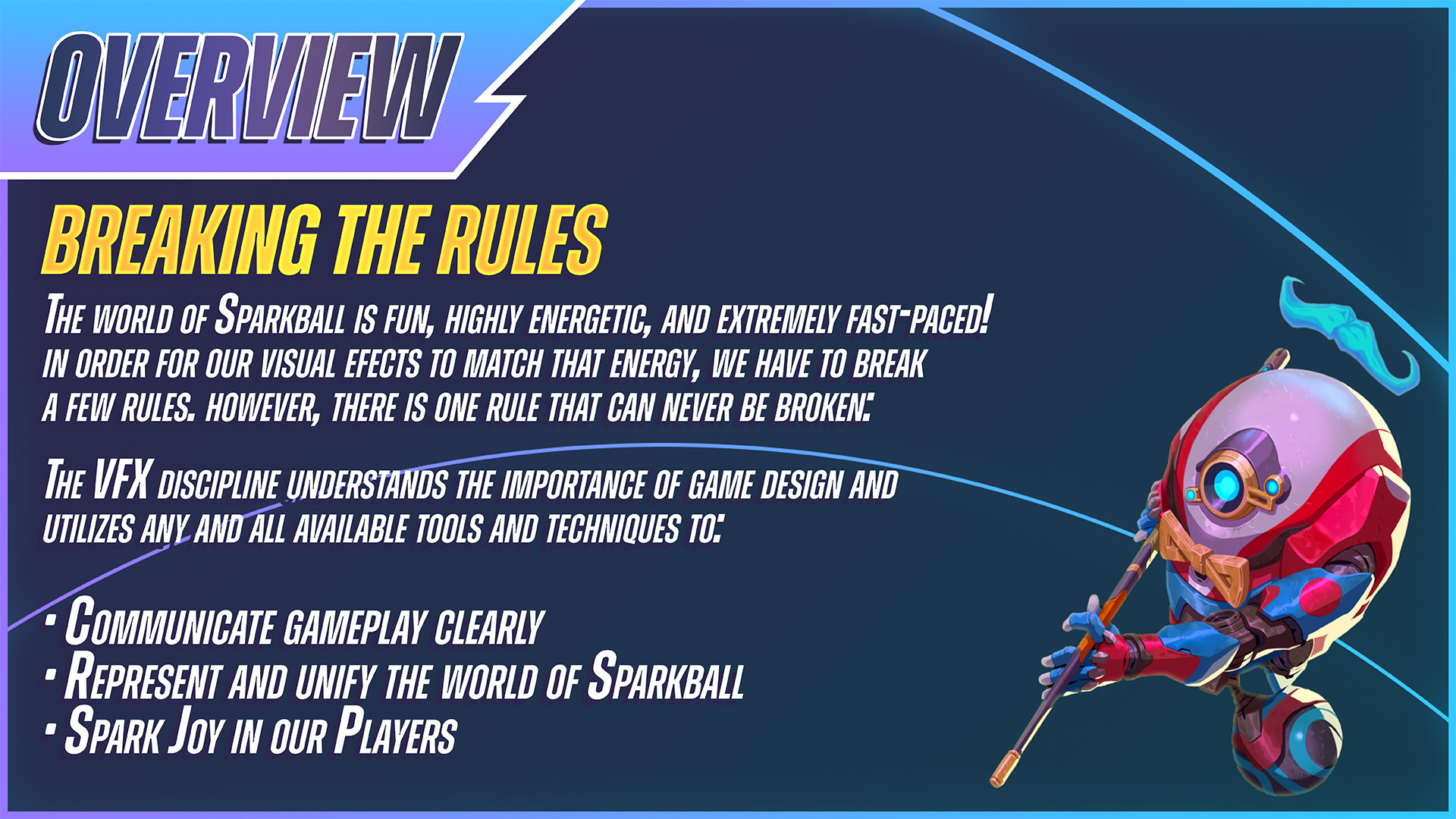
After my first few playtests of the game, it became very clear that there was something special about Sparkball. It didn’t feel quite like any other MOBA I had played before.
Decisions have to happen fast, so much is based on instinct, and quick reflexes are an absolute must. All of which means nothing without the complete cooperation of your teammates.
Early on in development, we had some placeholder VFX, which I wouldn't describe as terrible, but they felt out of place. Many were desaturated, very conservative in value, and shapes were wispy and ethereal.
When broken down individually, they seemed quite pleasant, but in the middle of a game, they were almost impossible to see. The ones we could see clashed with the bright bubbly style of the rest of the game. The more I investigated and experimented, I started to realize a bolder approach was necessary.
This thrilled our Art Director, Alvin Lee, who encouraged me to push the envelope so we could hit a more Anime style with the effects. (Big thanks to Alvin for his constant support and vision!)
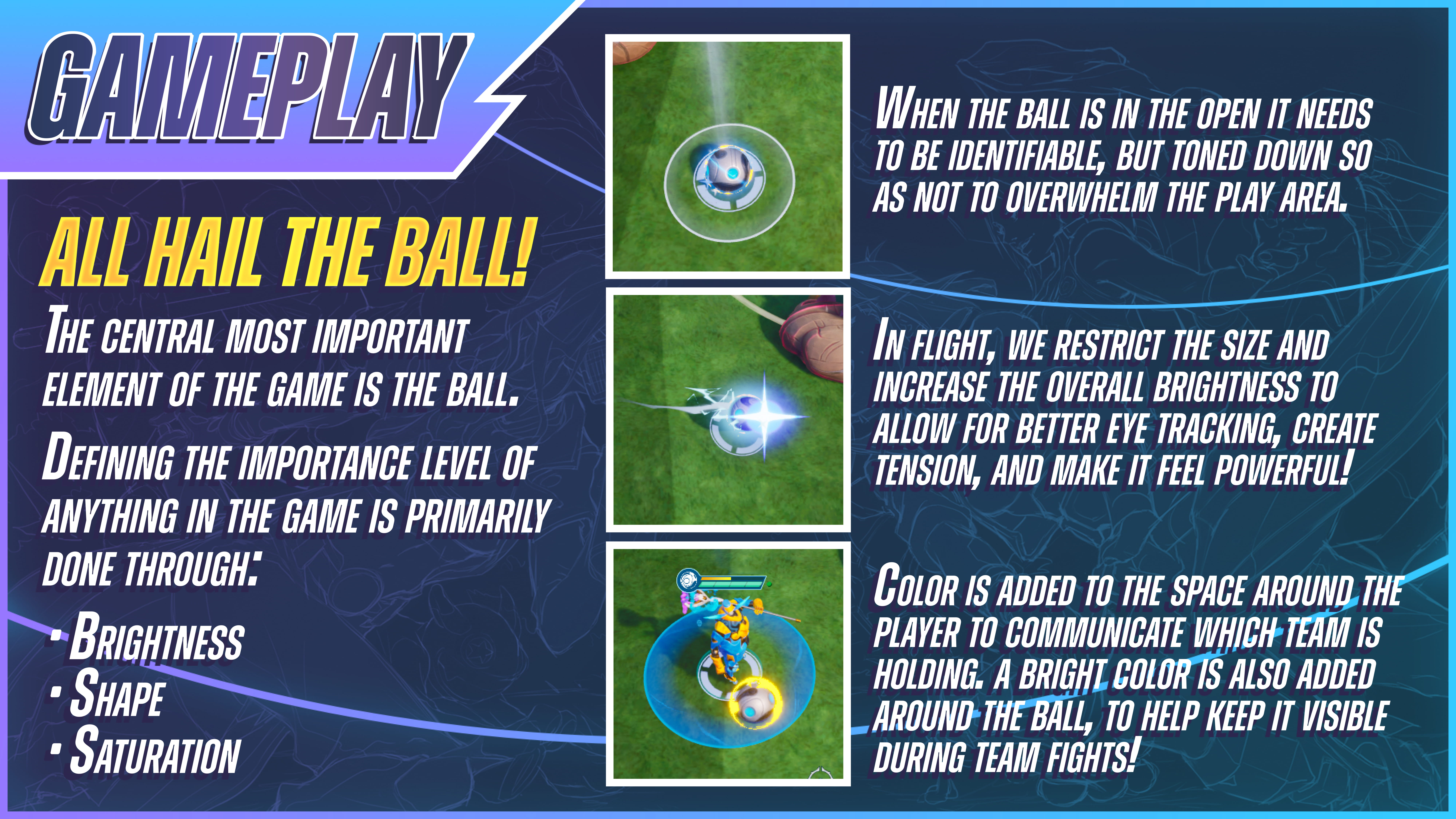
The game really does revolve around the Ball, it’s essentially soccer after all… but with magic! And a giant toilet!
We went back and forth countless times on how to best convey all of the information the Ball contains; buffs, shields, which team has the ball, when it’s in flight, when it’s idle, about to reset, when it’s capable of stunning enemies, there’s a lot! But we also wanted/needed to keep it minimal and clean.
Eventually, it all came together into an intuitive little package that’s easy to read and satisfying to use.

A recurring theme with Sparkball’s effects is efficiency and readability. Keeping core ideas like friendly or dangerous zones minimal was our first step to ensuring players could tell immediately what was going on.

Color and value is where we break the most rules, but surprisingly, it works for us! We can’t break or bend the rules without first knowing what they are. Typically for effects, in most games, we want to keep our saturations and value within a certain range. Higher than the characters, but slightly lower than the UI.
A general rule is, if your color range is already at the ceiling, you’ll have less room to operate, less range to utilize. For Sparkball, we can use this to our advantage, and in turn less really can be more!

In the example here, I talk about “crunching” the gradients, at least, in certain areas. We still want a decent gradient in some places, particularly the darker regions, in order to balance the brighter elements and add some richness. Where gradient crunching really comes in handy is during the highlights, the pop color.
Not only is it unnecessary for them to blend, often creating muddy areas that are tricky to work around, but that blending creates a softness that detracts from the intensity that’s called for. It’s a little hard to describe I’ll be honest, but it’s definitely something that can be felt in game.
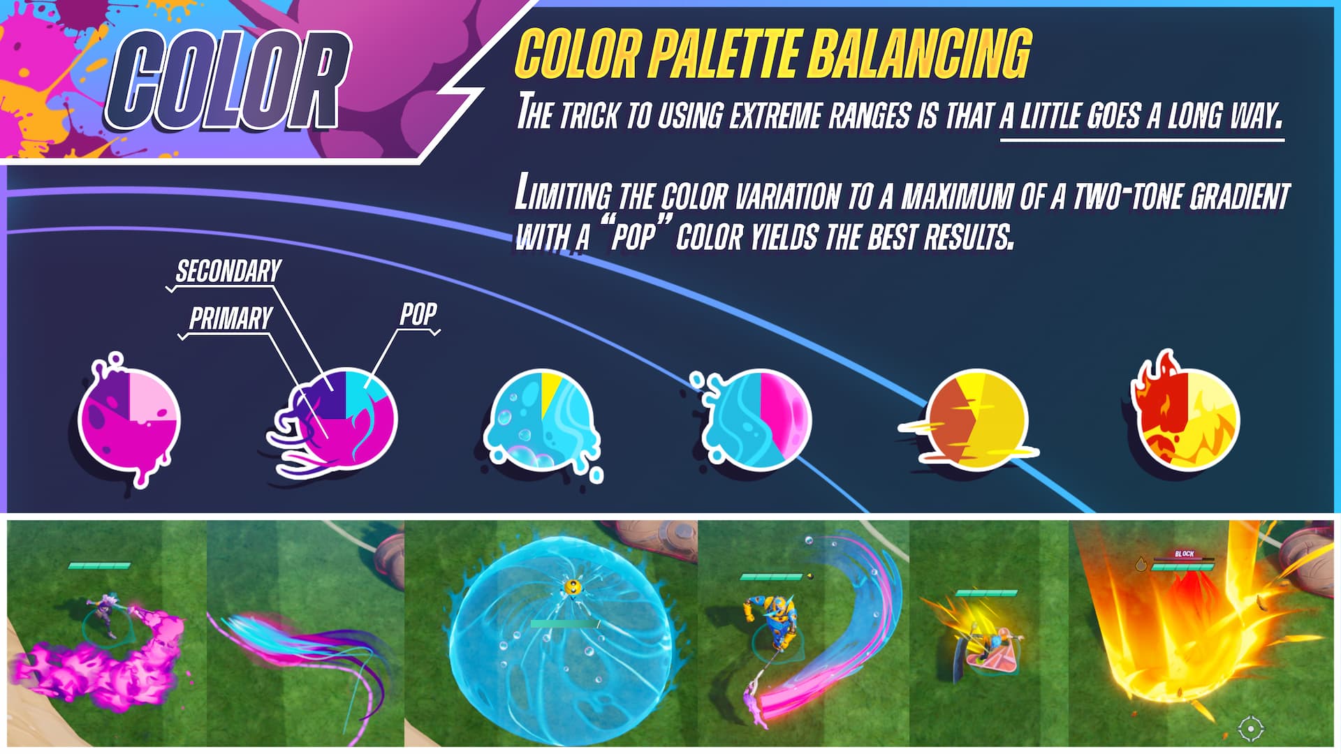
There’s always a trade-off to breaking the rules, but I’ve found that embracing the limitations can be quite freeing. We aren’t trapped in the box with creativity, it’s trapped in there with us!
For example, by pushing our saturations and values so high, we risk creating too much contrast by extending the range too low. It’s sort of like balancing on a tightrope of color. Keeping the color palette limited to variations of analogous and triadic tends to work best. Introducing any more increases the risk of creating too much contrast and visual noise, but most of all it’s usually unnecessary. A little really does go a long way.
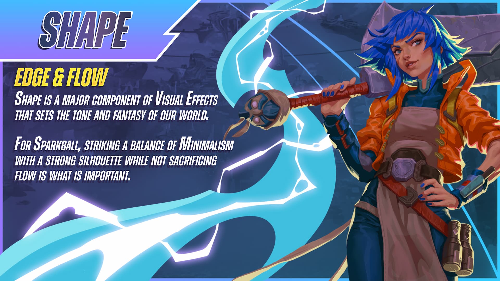
Another reason we’re able to “crunch” the gradients is because our shape language is carrying most of the effects. The style is a blend of minimal, hard edge, with a major emphasis on flow. For us, shape and color have a symbiotic relationship.
The high contrast in the values end up creating a supporting shape within the main body of the effects. We can create subtle intricacies, but it's always important to keep a mindset of “broad strokes” with the shape language.
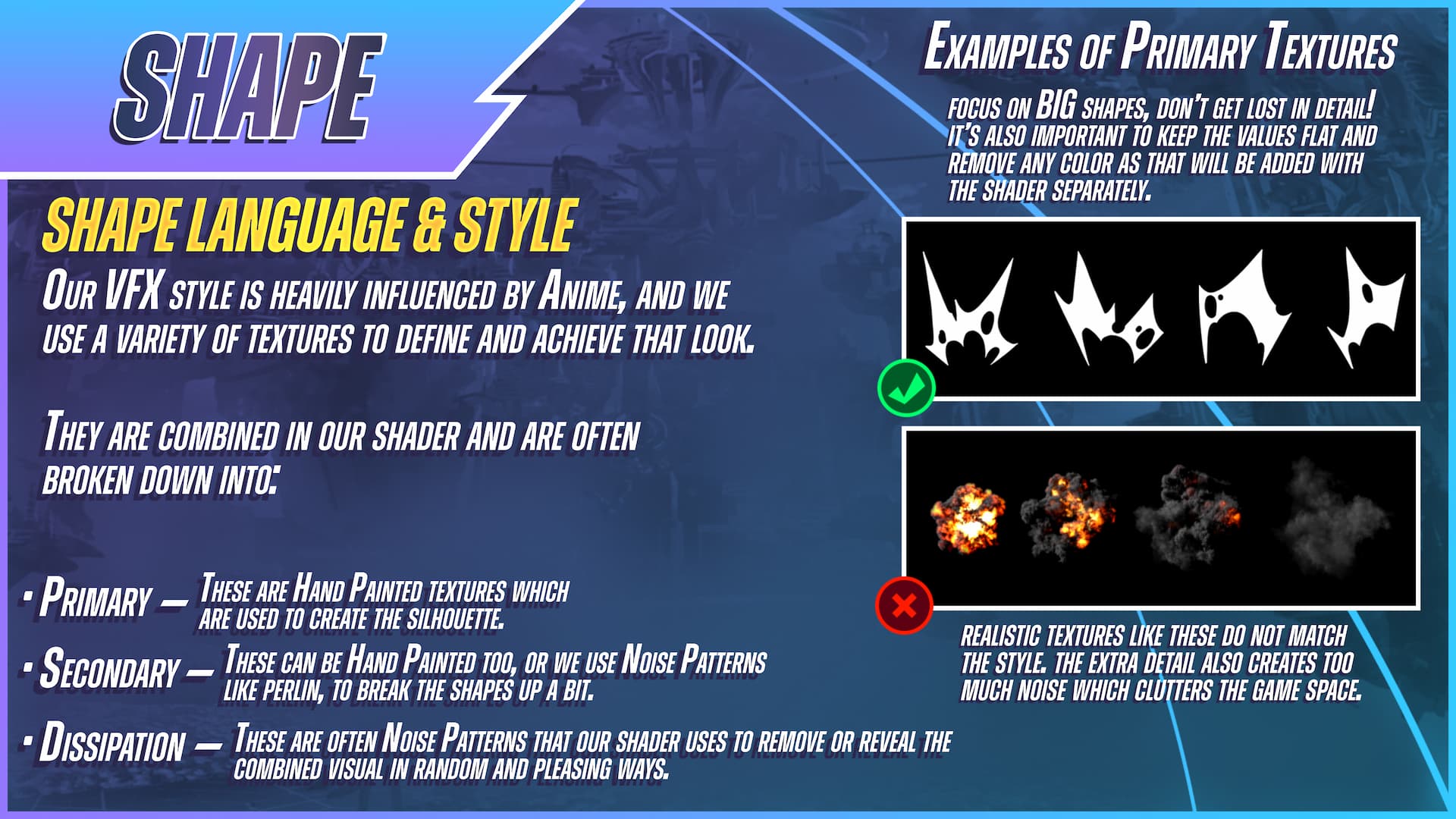
I use hand painted textures for all of the effects I work on, and I focus on keeping the shapes large, simple, while incorporating thick and thin lines for balance. We don’t want to use any overly detailed textures, or anything that looks too realistic.
I try to remind myself that the player’s eyes, in the middle of a heated game, are looking for only the most important information. As a player, just looking at something costs time and energy, and effects can fail when they draw too much of that attention. We want to reward players with satisfying moments, while also keeping it brief, and appropriate shape language is essential for that!
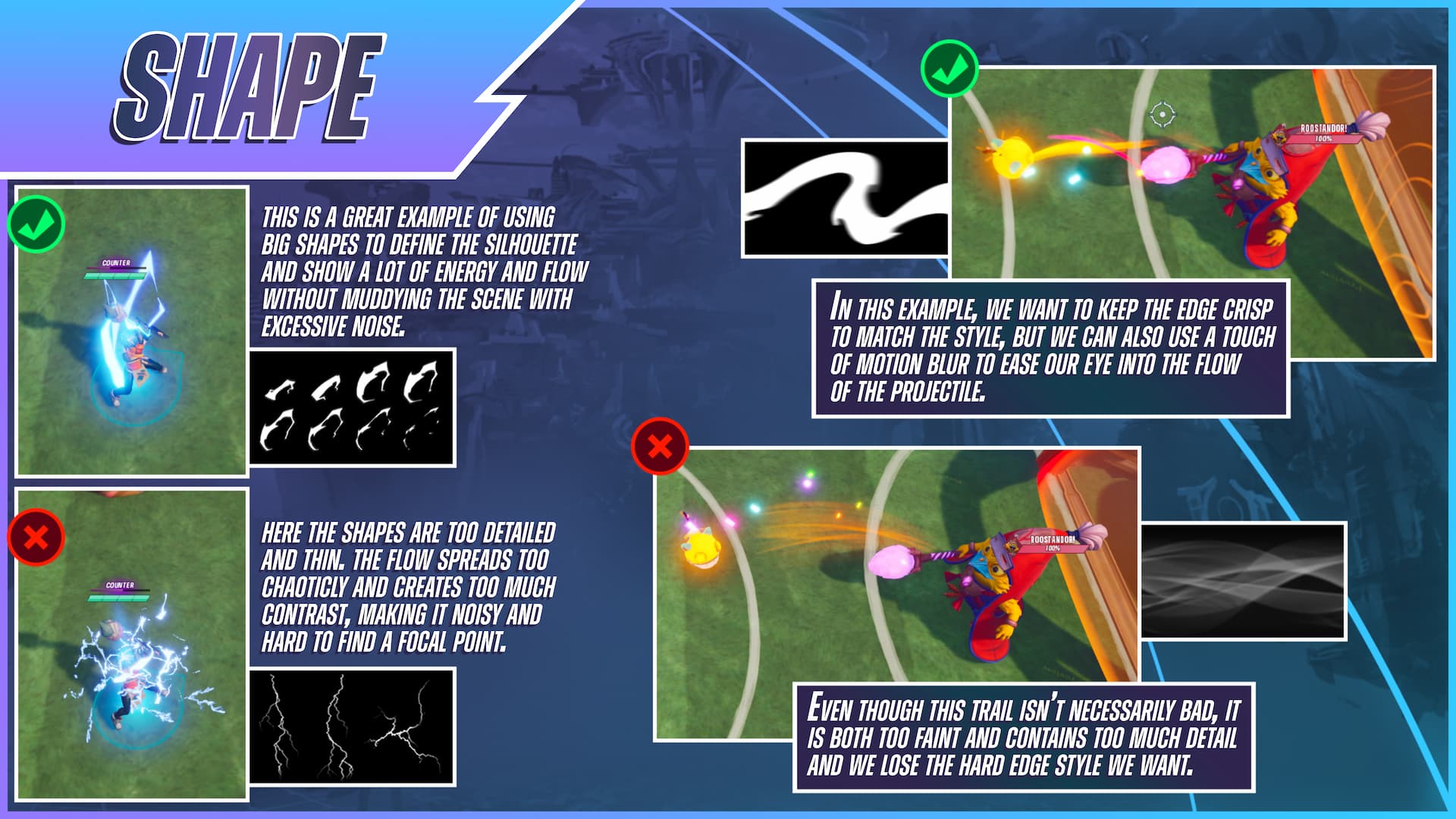
Earlier I talked about how some prior effects that were using softer, more elegant shapes didn’t work well for us. Here is a quick example of that. In the lower image, the trail is using a texture that normally would work fine for many effects in other games.
There’s nothing wrong with this texture, but what we found was that because of how faint it is, players just weren’t able to see it, or at least, not in time. Which is what matters most! Even though the primary element of the projectile, the happy little bomb, was plenty bright, it just wasn’t supported well by its secondary component.
I’ve mentioned our shapes being hard edged a few times now, but there’s some wiggle room here. Like the texture in the example above. Giving it some slight motion blur is useful, and necessary! Our intention with the shape language is to keep the shapes bold and edges crisp, but there are certainly moments where we need to soften things a bit in order for them to move across the screen smoothly. We have to keep the flow of the effect in mind at all times.
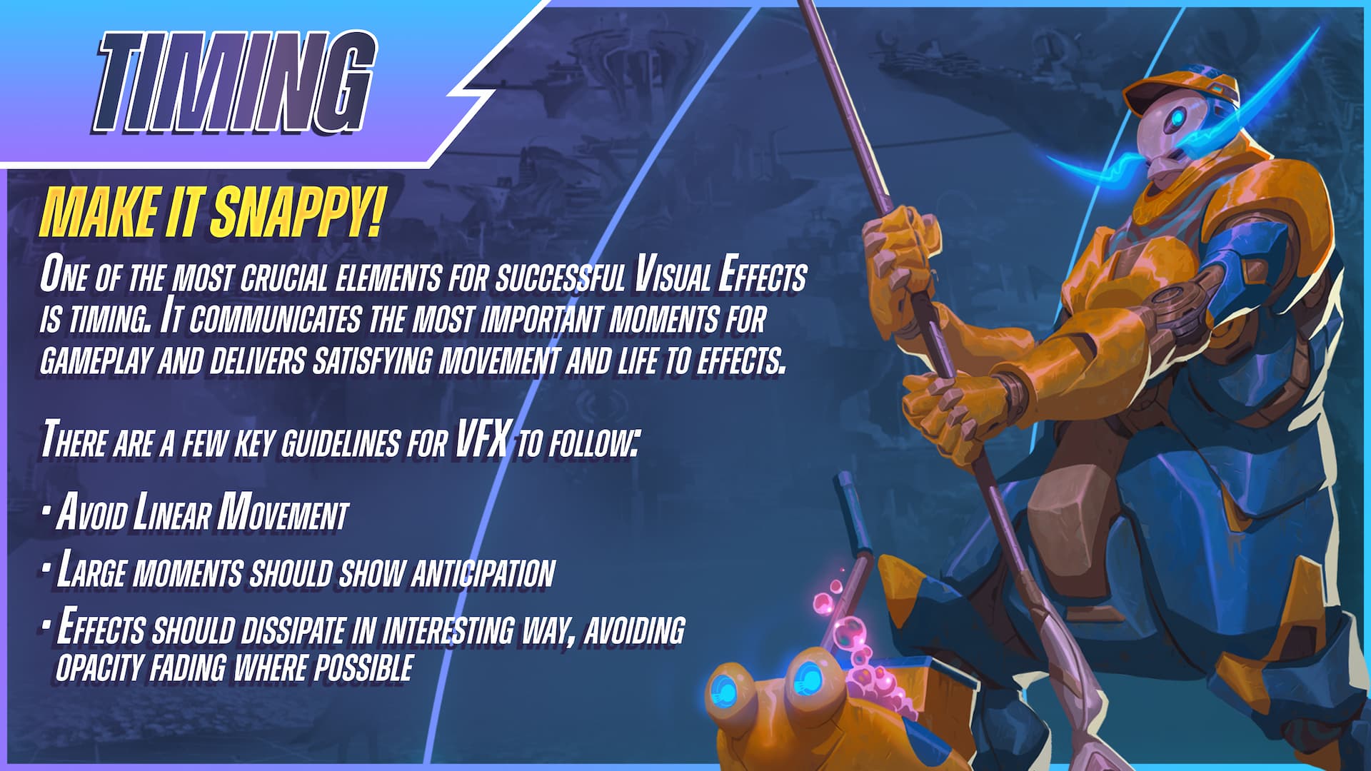
In any effect, you’ll find that timing is what truly makes or breaks it. The colors, values, and shapes can all be stellar, but if the timing is off, the whole thing will come crashing down. For Sparkball, we try to keep the timing “snappy” and interesting.
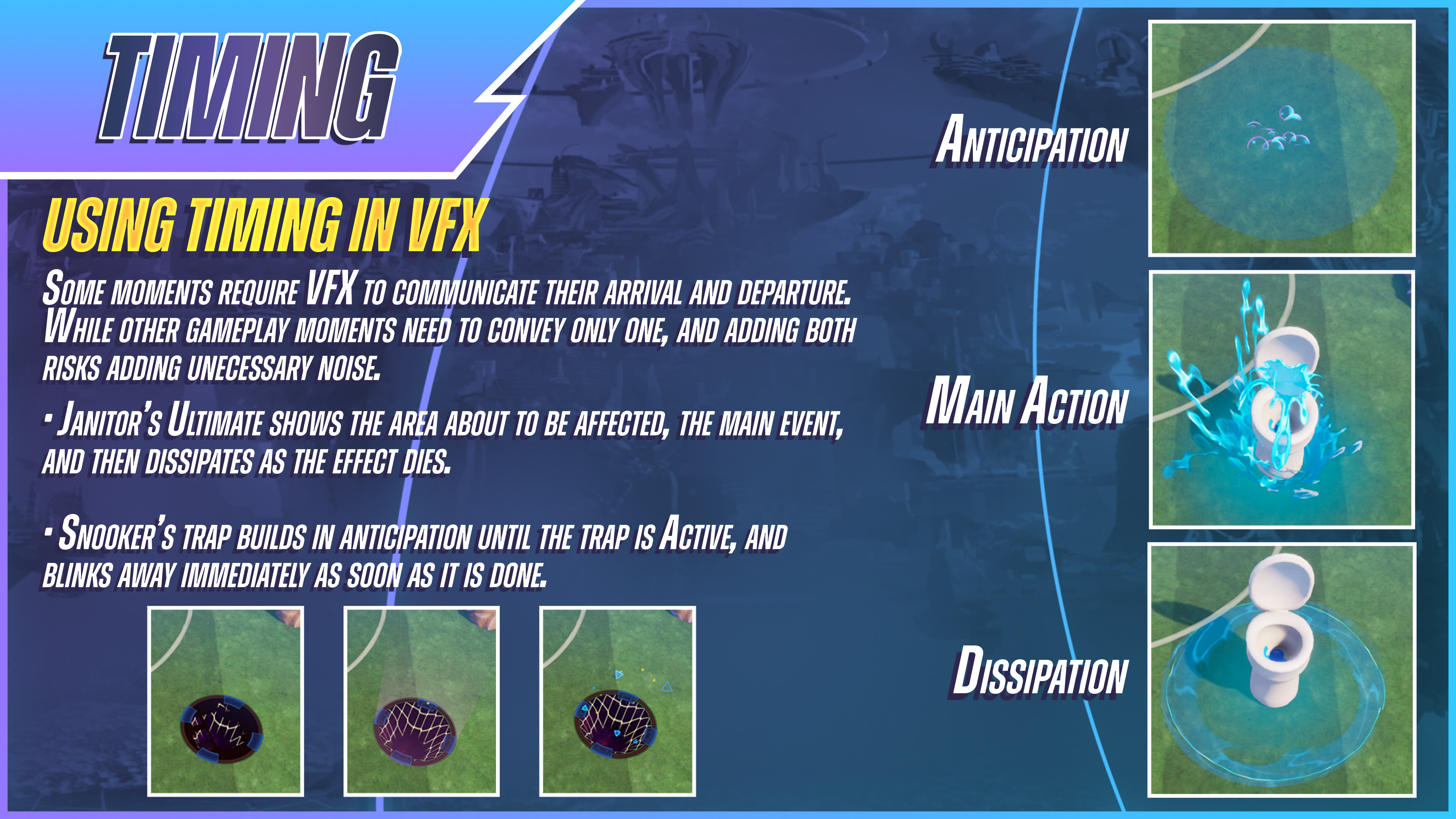
Another way of thinking about it might be, we almost always want the main action of an effect to occur and finish (or begin to dissipate) within the first quarter of its lifetime, allowing it to fade out gradually over the rest of its lifetime through an erosion or some kind of interesting dissipation.
As with every other component we’ve talked about so far, we want to maximize the most necessary information for the player, while minimizing any guess work, in order to save them precious observation time. Timing is no different, but it comes with its own rules, and each instance can have its own needs.
In this timing example, we have Snooker’s stun trap that he throws onto the ground. Normally, I’d add a dissipation effect towards the end of its life; either a fade, or an erosion of some kind, but instead, having it blink out made it read more succinctly. I chose this as an example because it’s an extreme edge case that I find fascinating. Most commonly, having a natural dissipation, especially on big gameplay moments, provides clarity and satisfaction. Timing is all about knowing when to hold 'em and when to fold 'em.
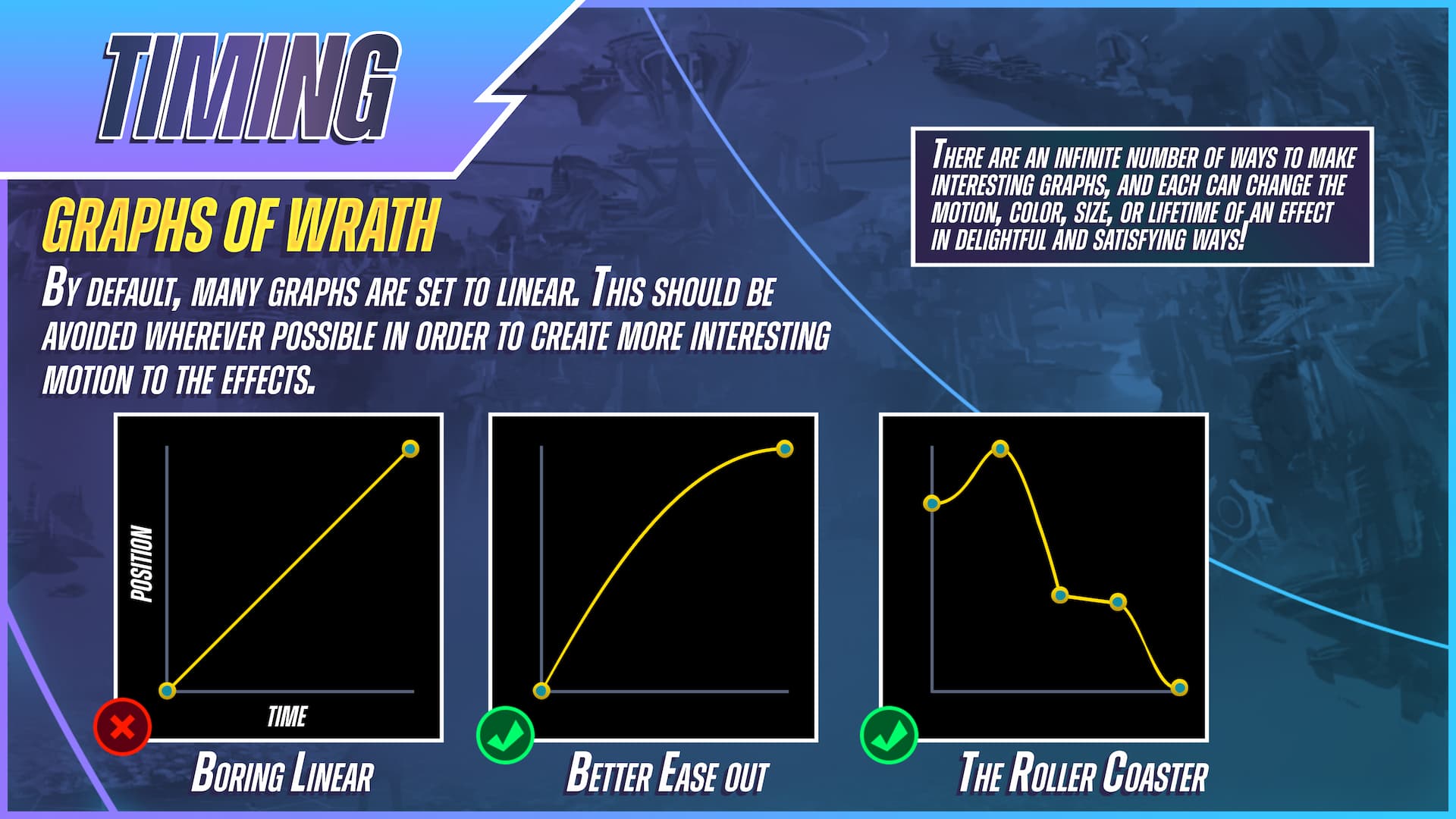
Last, but not least, I cannot stress enough the importance of using graphs! Good effects have a combination of macro and micro timing; from the overall flow and motion, to the change in a single particle's size or color.
The smallest things can add a ton of value and build up the effect in more dynamic ways. For Sparkball, we want to keep things lively and interesting, so we avoid using any kind of linear timing wherever possible. The end result, hopefully, is a more engaging and satisfying effect for the player. When done right, good timing is something that the player doesn’t even notice, it just feels natural and right. Timing is the unsung hero of visual effects!
Thank you for joining me today! I hope my passionate ramblings were informative, or at the very least entertaining. Till next time, I wish you all the very best in your journeys through this amazing and ever inspiring discipline that I love so much.
-Hallzy
More like this:
- The 5 Must-Know Artistic Principles of Video Game Visual FX
- 10 Design Tips from the League of Legends VFX Style Guide
- A high-resolution copy of Sparkball's VFX Style Guide can be found on David's LinkedIn here.
Learn to Make Stylized Effects with VFX Apprentice
Start Your VFX Apprenticeship
Begin your journey towards mastering FX for games and animation. Join VFX-A All Access and discover cutting-edge 2D, 3D, and real-time FX training.