Color Theory 101 for VFX Artists
Nov 06, 2023
What do RGB and HSV even mean? Let's dive into the fundamentals of color and how to use color to create visual effects.
Follow along with VFX Artist Dave Shovlin (VALORANT) as he guides us through the basic fundamentals of understanding color theory and how to think about color as a VFX artist.
This video is the first lesson in the Color Theory for VFX course from VFX Apprentice All Access.
What is Color?
So what exactly is color? You might know that light is a type of electromagnetic radiation, which we can mostly classify according to its wavelength. Most of these classes are invisible with infrared, microwave, and radio wavelengths being too long for our eyes to see for various physical reasons. Ultraviolet, X-rays, and gamma rays are too short to see.
Most humans have tri-chromatic vision, meaning our retinas contain three different types of photo-receptive cone cells: short, medium, and long (S, M, L for short). They're called cone cells because they have these little cone shapes at the end of them. These each see overlapping sections of this little band of M frequency range, and that's what we call the visible spectrum.
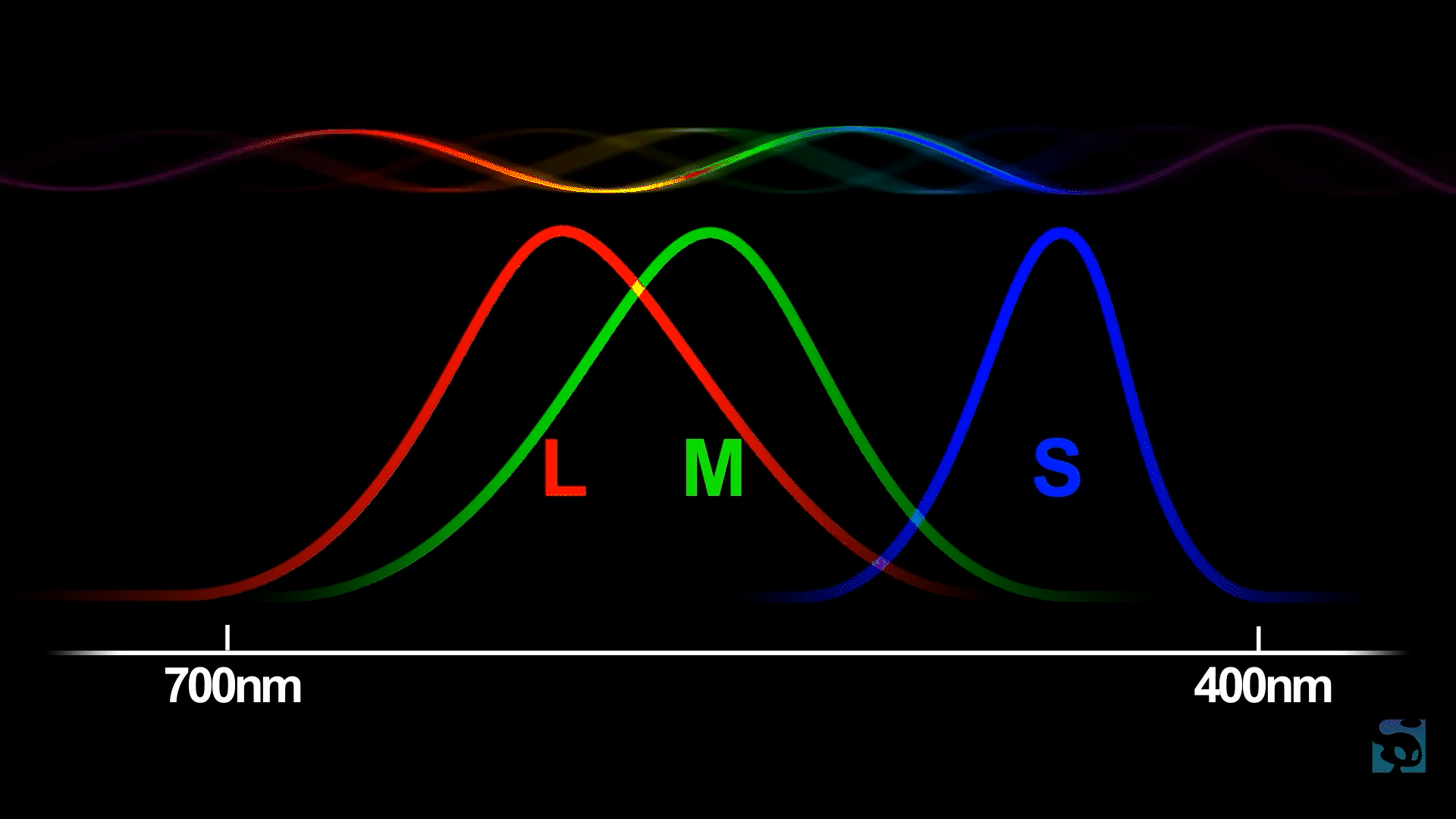
Red is our word for the longest wavelength that we can see. Blue is what we call the shortest. The color Green is somewhere in the middle. Violet or purple appears to us as a color between red and blue, because our L cones are ever so slightly receptive to the frequencies at the very shortest end of the spectrum where our S cone range falls off.
So all the colors you see are your brain interpreting the activation patterns of these three types of cones. Your brain makes up all the colors in between, including colors that don't exist in the spectrum, like magenta, which is its interpretation of a mix of very short and very long wavelengths.
This is why color can be modeled as a wheel as well as a straight line. So the next logical question is: what is the color wheel?
Understanding the Color Wheel
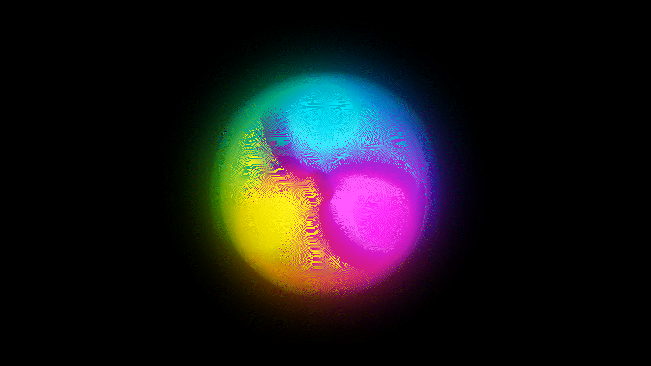
The color wheel is a visual representation of the relationships between colors. It's a circular diagram that organizes colors in a way that helps people understand how they relate to one another and how they can be combined to create various color schemes and harmonies.
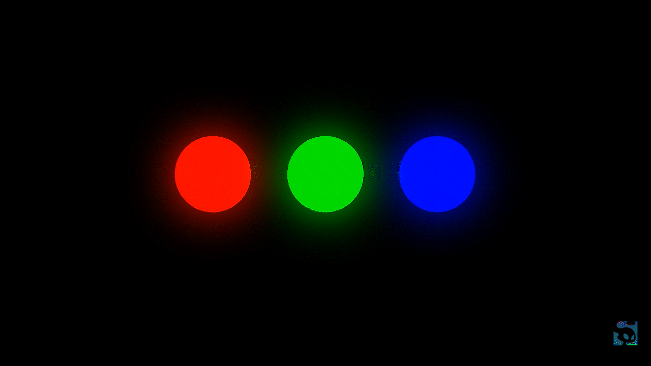
This is also why primary colors mix to form secondary ones and monitors only need to emit light in three wavelengths (RGB) to simulate the entire visible spectrum. Now, this idea of primary and secondary colors changes relative to the medium that you're working in. Before color monitors, the idea of primary color was defined in the art world by the behavior of physical media.
The application of pigment or dye causes a surface to absorb the majority of the light hitting it. So that reflects back only a single wavelength, which is why pigments like those in a printer cartridge always darken when you blend them. Monitors work the opposite way, adding light to a black surface instead of subtracting it from a white one. So the secondary colors often end up being brighter than the primary ones. A green made by mixing blue and yellow paint will always be less vibrant than a single green light-reflecting chemical.

Let’s talk a little bit about the different types of color sets within the color wheel and how they relate to each other with design and FX in mind.
Primary colors are a set of colors that are considered fundamental and cannot be created by mixing other colors. The primary colors are used as the building blocks for creating a wide range of other colors through various color mixing techniques, such as subtractive and additive color mixing.
Secondary colors are created by mixing equal amounts of two primary colors. In the traditional color wheel, the secondary colors are green (from blue and yellow), orange (from red and yellow), and purple (from red and blue).
Complementary colors are pairs of colors that are located directly opposite each other on the color wheel. For example, red and green, blue and orange, and yellow and purple are complementary pairs. Combining complementary colors can create a strong contrast and visual interest.
Analogous colors are colors that are located next to each other on the color wheel. These colors tend to harmonize well with each other and are often used in color schemes to create a sense of unity and flow.
Color Palettes and Style Guides
The color wheel can also be used to distinguish between warm and cool colors. Warm colors, such as red and yellow, are typically found on one side of the wheel and are associated with energy and warmth. Cool colors, such as blue and green, are on the opposite side and convey a sense of coldness or even calmness.
You’ll find when working for a studio or agency that a project will have a specific aesthetic direction that usually directly translates to color and creating a certain “vibe” with those colors. Knowing these types of color sets and how they work with each other is good for understanding briefs and project goals down the road.
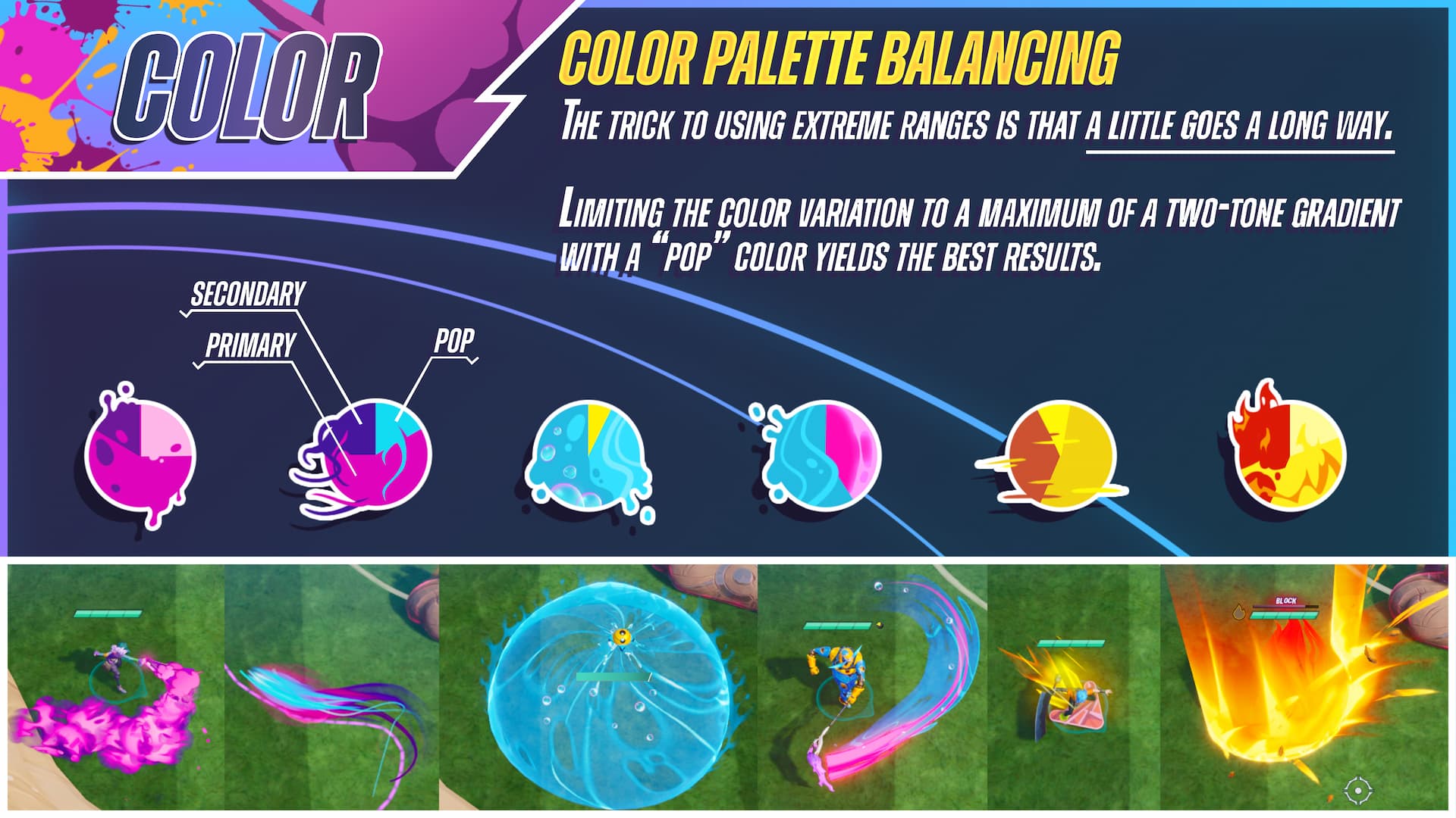
Game style guides will cover the preferred color palettes, color range, and more. Check out these style guides to see how they define color and more for artists as they develop a game.
We’ve also talked about color in games in the VFX Foundations and Artistic Principles course. If you’re looking for some more visual guidance for choosing VFX colors, you can watch this lesson below or get the entire course for free in our Free VFX Training.
Looking at a Standard Color Picker
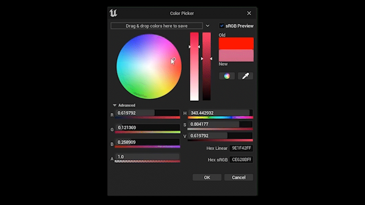
Okay, now that we've got that crash course in optics out of the way, let's have a look at Unreal Engine's color picker. It's very similar to the one that you'll find in Photoshop, Procreate, Animate, or Unity. The color wheel and RGB values are found on the left. You've also got Alpha, or transparency, which is how much the color blends with whatever's behind it.
Apart from these, you'll see another set of three values and that's HSV, which stands for Hue, Saturation, and Value. Instead of Value, you'll sometimes see B for brightness or L for Luminance, but it all means the same thing. HSV are the three main characteristics we think of for a specific color.
- Hue describes which shade of the color, or the name we give colors based on their wavelength.
- Value describes how close to pure white or black it is, or so how dark or bright it is.
- Saturation is the purity or vibrance of the color.
In order to use color effectively, you need to develop an intuitive understanding of how hues blend and their location relative to each other, on the color wheel. This comes to some people more quickly than others.
So if you're new to this really simple little exercise you can try color matching as if you were painting, but using RGB. Think of or look at a color you want to make and see If you can guess the RGB value. This is a fantastic way to strengthen your understanding of the color wheel and color theory as a whole. Then punch it in to see if you're right. You'll end up surprising yourself by how close you can get!
More Like This:
- Choosing colors in Game VFX
- The FX Artist's Guide to Area of Effect (AoE)
- Crafting the VFX of World of Warcraft: Dragonflight
- What Riot Games Head of Creative Looks For in VFX Artists
Learn VFX for Games and Animation
Are you ready to elevate your VFX skills and work on video games and animated projects like the pros? Our VFX courses are led by FX industry leaders who will not only guide you through fundamentals, they will prepare you to work at leading studios and VFX houses.
Start Your VFX Apprenticeship
Begin your journey towards mastering FX for games and animation. Join VFX-A All Access and discover cutting-edge 2D, 3D, and real-time FX training.